"A user interface is like a joke.Martin Leblanc
If you have to explain it, it's not that good."
Spokester
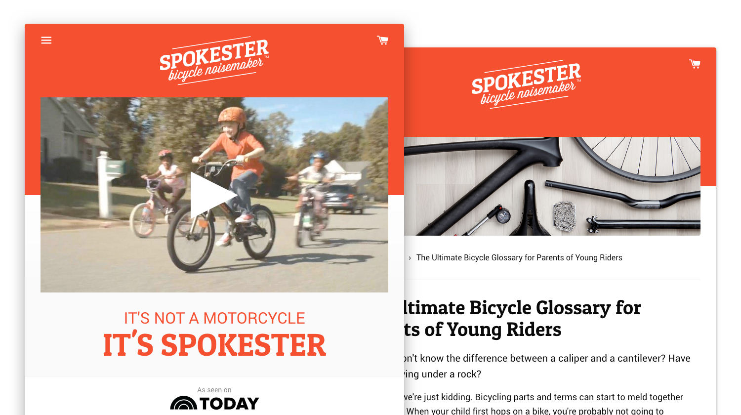
A small family toy business, Spokester sells online via spokester.com and via Amazon. This site needed to be colorful, playful, and fun, but also convert well.
Most ecommerce sites are designed with the assumption that there will be multiple products, however Spokester is a singular product with only color variation. In order to streamline the consumer’s path to a successful checkout, I removed the product page entirely from the default flow and allow adding directly to cart with one click.
- Front-end development
- Graphic design
- User experience design
Modular charting patterns
Complex data display is tough to do well. Sure, you could pick up an Edward Tufte book and dive deep into the weeds to figure out how best to present your data science, but that really only solves part of the problem.
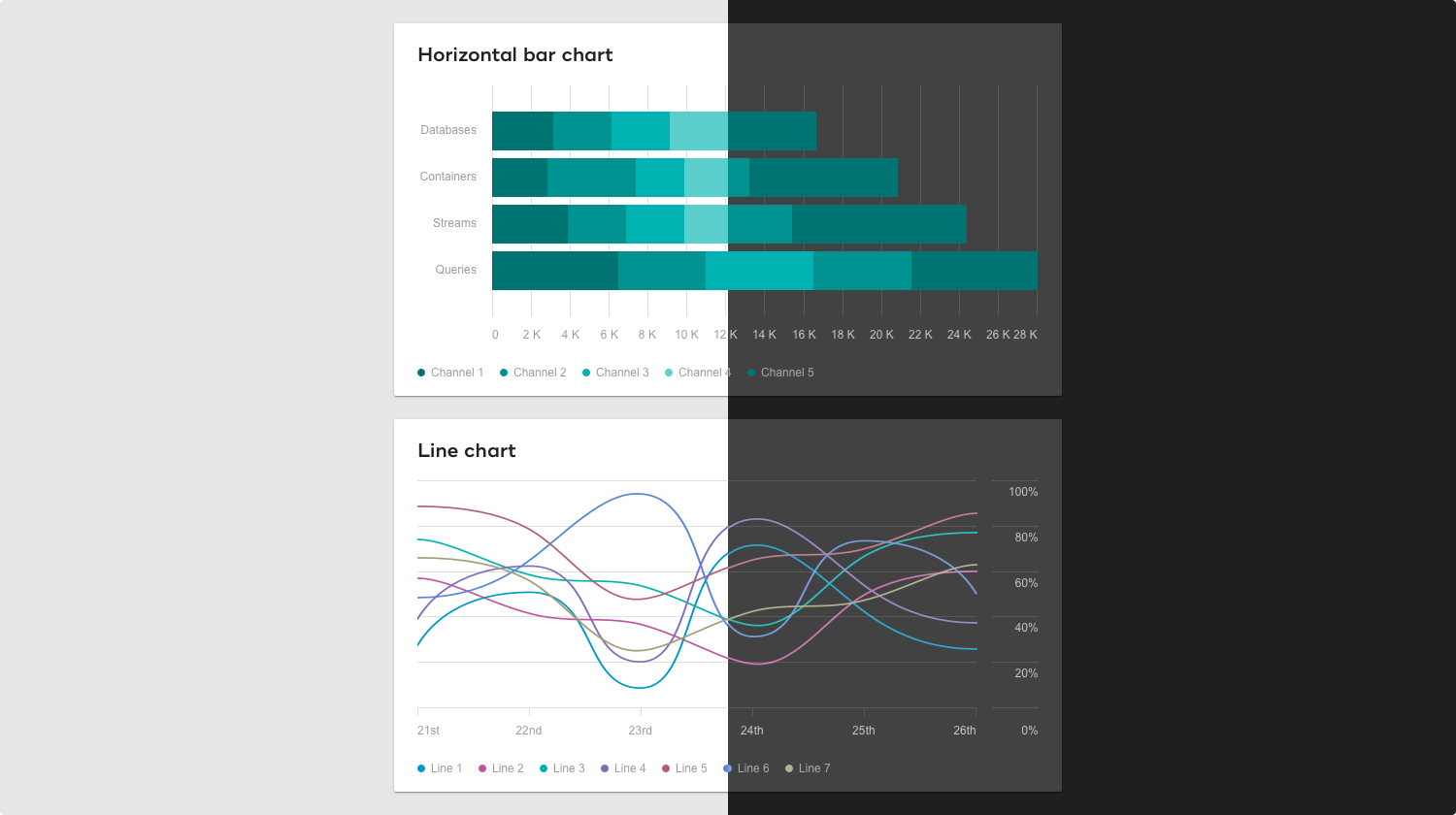
If you're planning on doing this more than once (you're a major corporation, perhaps?), you're going to figure out more than just this specific chart. You're going to want to make sure that all your charting standards are figured out ahead of time. That way, when the time comes you can snap together the pieces you need and get off to the races. Bonus points if they all look like they came from the same brand.
Above is a sneak peak of just one such project. Note that we planned ahead for both light and dark applications. More on that later.
- Design systems
- Graphic design
- User experience design
Teradata Analytic Calculator
My prior experience up until signing on with Teradata was consumer focused, so switching mental gears to do complex power user UIs took some adjusting.
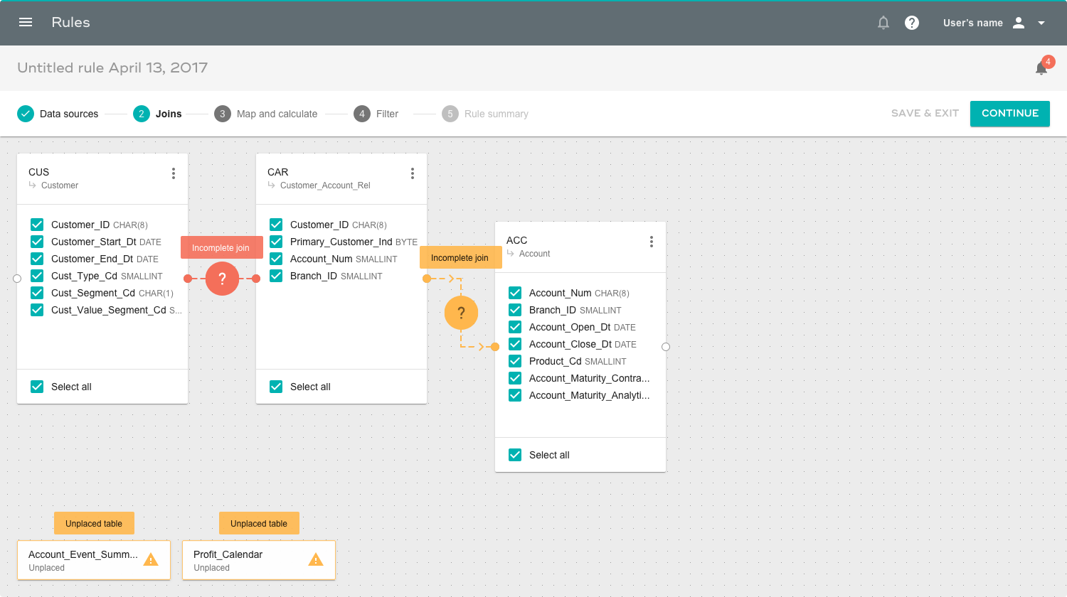
TAC is a business user focused web app that allows for importing, manipulating and transforming data in complex ways. It's an interesting problem to find the right balance between abstracting hardcore concepts like database connections, tables, and fields for ease of use without making the tool too simple and therefore useless.
- Design systems
- Graphic design
- User experience design
Accessible state system color palette
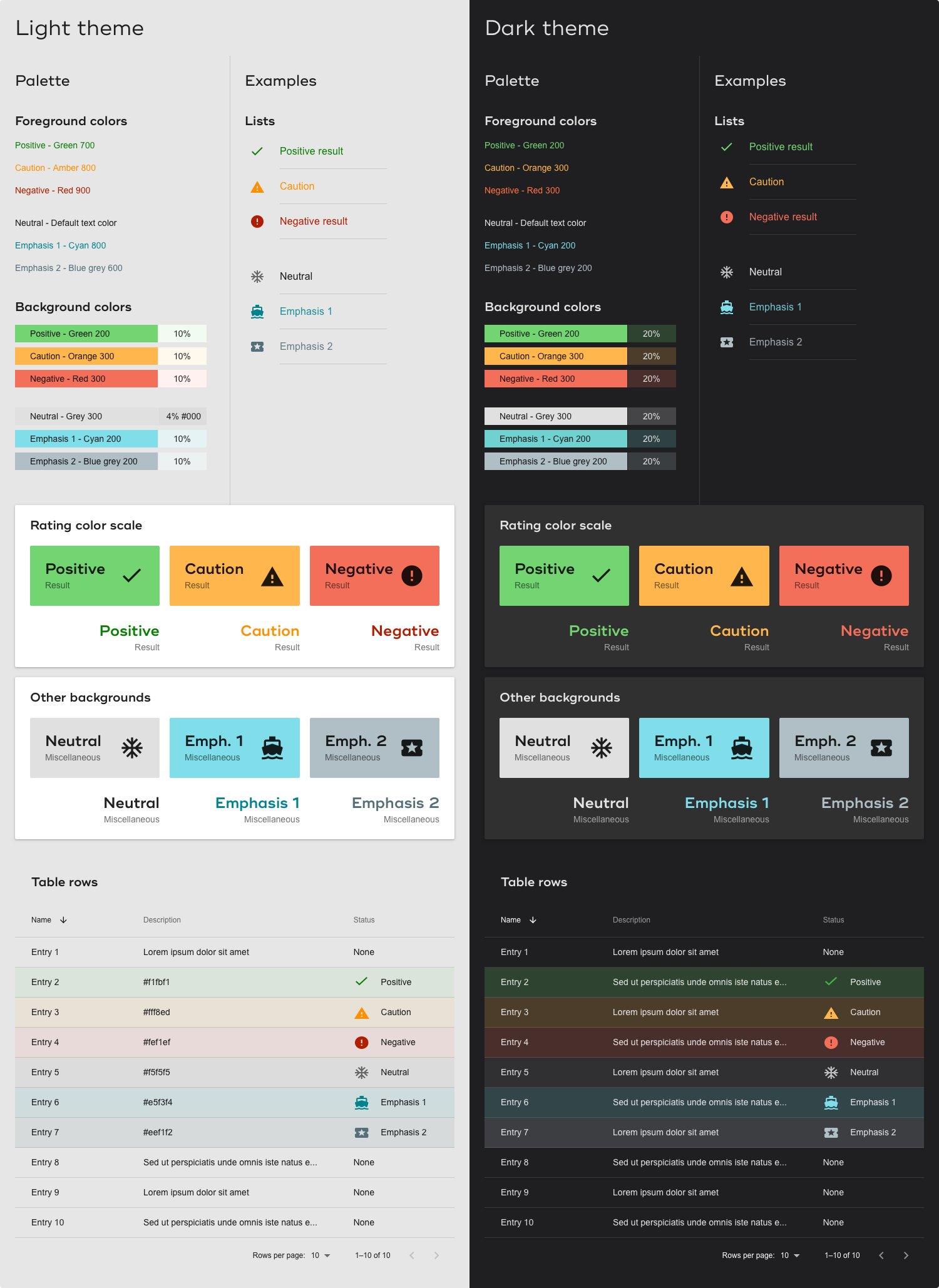
I've found that the smallest building blocks are the most important parts of a design system, because they're foundation on which everything else is built. Above is part (there's more!) of a color palette I put together to provide presets for common use cases.
Until this point, we had a total of one state color ("warn" - I renamed it "negative" for semantic reusability). After this exercise we had a full set of standard colors for positive, caution, and negative circumstances. We also provided for unknown future situations with "neutral" and "emphasis" colors which are intended to be non-opinionated.
These are all tested to beat WCAG AA accessibility contrast ratios. Which is very very tough to do when you also want it to look good.
- Design systems
- Graphic design
Medfusion health record web app
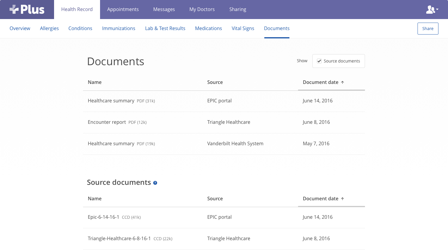
Medfusion's health data aggregation allows a consumer to collect all of their medical records across various providers into one central location. Here we show everything that the system has collected, both understandable stuff like PDFs and machine-readable things like the Continuity of Care Documents that medical records providers use to store and share information.
This is a simple UI showing a sample of a pretty standard list view within the health record.
- Design systems
- Front-end development
- Graphic design
- User experience design
Medfusion Plus mobile app
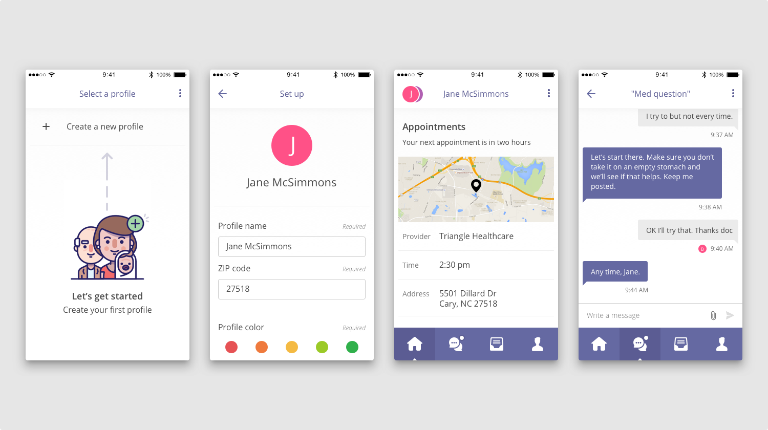
This app was intended to allow the consumer to take a unified, aggregated health record with them wherever they went, automatically assembled from their various providers and kept continuously up to date.
Here are a smattering of representative samples of the UI. This is a good example of why making the UI boring pays off: the standard stuff like lists and menus are easily understood at a glance, and then we get to play with illustrations and color to really add value without being confusing.
- Design systems
- Front-end development
- Graphic design
- User experience design